See every provider's anesthesia case volume and utilization each week
Every Monday, WebRun opens Graphium Health, pulls the prior week's case count, anesthesia time units, and OR utilization rate for each active provider across all facilities, logs the results to a Google Sheets utilization dashboard, and posts a weekly summary digest to your group administrator in Slack.
- No credit card
- Under $0.01 per run
- Cancel anytime
How do I automatically track anesthesia provider utilization and case volume each week?
WebRun opens Graphium Health every Monday, pulls each active anesthesia provider's case count, total time units, and OR utilization rate for the prior week, and updates a Google Sheets utilization dashboard with four-week rolling trends. A digest highlighting the highest and lowest utilization providers is posted to your group administrator in Slack, so staffing decisions are grounded in current data every week.
- Group administrators see every provider's prior-week case volume and utilization every Monday morning
- Four-week rolling trends reveal rising or declining volume before it becomes a staffing problem
- Under-utilized providers are highlighted automatically so the administrator knows where to redirect cases
Built for anesthesia group administrators · anesthesia practice managers · medical directors · multi-site anesthesia groups
What does WebRun do on every run?
The exact actions WebRun takes, in order - in plain language, so you can adjust anything.
-
WebRun signs in and gets to work
Opens
app.graphiumhealth.comin a real browser with your saved login - no setup, no API keys. -
1
Graphium Health - pull prior week case volume and time units by provider
graphiumhealth.com How to Automate Graphium Health
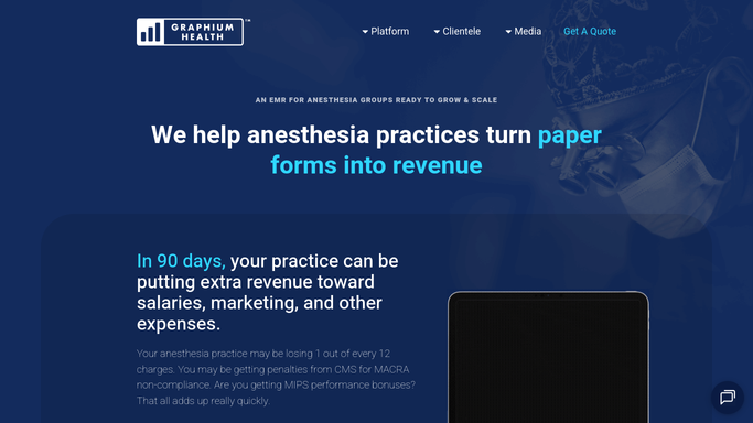
WebRun opens Graphium Health to pull prior week case volume and time units by provider. - Open Graphium Health and navigate to the analytics and productivity reports section
- Pull the prior week's case count, total anesthesia time units, average case duration, and OR utilization rate for each active provider
- Note any provider whose case volume fell significantly below their contracted hours or prior-week average
- Collect facility-level totals as well so the administrator can see both provider and site performance
Done when Case volume and utilization data for every active provider and facility for the prior week are collected.
-
2
Google Sheets - update utilization dashboard
google.com How to Automate Google Sheets

WebRun opens Google Sheets to update utilization dashboard. - Append this week's data to the provider utilization dashboard sheet, one row per provider per week
- Update the rolling 4-week trend columns so the administrator can see whether volume is rising or falling
- Highlight any provider with utilization more than 20 percent below their target for the week
Done when The Google Sheets utilization dashboard is updated with last week's data and trend indicators.
-
3
Slack - post weekly provider utilization digest
slack.com How to Automate Slack

WebRun opens Slack to post weekly provider utilization digest. - Post a utilization digest to the group-admin Slack channel listing each provider's case count and time units for the prior week
- Call out the highest and lowest utilization providers so attention goes to the right place
- Include a link to the full Google Sheets dashboard for detailed facility-level data
Done when The group administrator has last week's provider utilization digest in Slack every Monday morning.
How is each run configured?
Secure by default
Connect once, stays signed in
WebRun signs in once and keeps each session in a persistent environment, so every run picks up right where it left off.
Every action is checked against this policy before it runs.
Questions, answered
Does it include individual patient case details in the Slack digest?
No. The digest shows aggregate metrics only: case counts, total time units, and utilization rates per provider. No patient-level or case-level information is included in the Slack post.
How does it calculate the OR utilization rate?
It reads each provider's total booked anesthesia time from Graphium Health's productivity reports and divides it by their contracted available hours for the week, producing a percentage utilization figure consistent with Graphium Health's own analytics.
Can it break down utilization by facility for multi-site groups?
Yes. The Google Sheets dashboard includes facility-level rows for each provider, so the administrator can see not just total volume but how each provider's time is distributed across the group's contracted locations.
Related templates
Put this on autopilot.
Turn it on in minutes - or have our team set it up for you.