Track excursion trends by lane to find your riskiest cold-chain routes
Every Monday, WebRun opens Tive, pulls the past four weeks of excursion events, groups them by lane, calculates each lane's excursion rate, average severity, and worst single event, and writes a ranked trend report to Google Sheets so your team can see which lanes drive the most cold-chain risk.
- No credit card
- Under $0.01 per run
- Cancel anytime
What does WebRun do on every run?
The exact actions WebRun takes, in order - in plain language, so you can adjust anything.
-
WebRun signs in and gets to work
Opens
platform.tive.comin a real browser with your saved login - no setup, no API keys. -
1
Tive - pull four-week excursion history by lane
tive.com How to Automate Tive

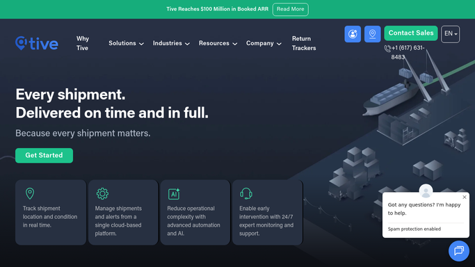
WebRun opens Tive to pull four-week excursion history by lane. - Open platform.tive.com and filter excursion events for the past 28 days
- Group events by lane (origin-destination pair)
- For each lane, calculate total shipments run, total excursion events, excursion rate as a percentage, average excursion duration, and worst single event temperature deviation
- Rank lanes by excursion rate, highest first
Done when All lanes have calculated excursion rate, average severity, and worst event metrics for the four-week window.
-
2
Google Sheets - write ranked lane excursion trend report
google.com How to Automate Google Sheets
WebRun opens Google Sheets to write ranked lane excursion trend report. - Open the lane trend Google Sheet and add a new dated tab for this week's report
- Write one row per lane with shipment count, excursion events, excursion rate, average duration, and worst event deviation
- Add a summary row at the top with fleet-wide totals and average excursion rate
Done when Google Sheet has a complete, ranked lane excursion trend report for the past four weeks.

How do I track cold-chain excursion trends by lane using Tive data?
Every Monday, WebRun pulls four weeks of Tive excursion events, groups them by lane, calculates excursion rate, average severity, and worst event for each route, and writes a ranked report to Google Sheets. Your team sees which lanes carry the highest cold-chain risk without pulling a single data export manually.
- Highest-risk lanes identified automatically every week
- Four-week rolling trend builds without any manual data pulls
- Lane-level excursion rates track the impact of improvement actions
Built for cold chain network planners · pharmaceutical logistics managers · food safety teams · temperature-controlled freight operators
How is each run configured?
Secure by default
Connect once, stays signed in
WebRun signs in once and keeps each session in a persistent environment, so every run picks up right where it left off.
Every action is checked against this policy before it runs.
Questions, answered
Can I change the look-back window from four weeks?
Yes. The look-back window is a run setting you can adjust. Common alternatives are 30 days for monthly reporting cycles or 90 days for quarterly business reviews.
Does it track improvement over time if I fix a lane?
Yes. Because WebRun adds a new dated tab each week, you can compare lane excursion rates across consecutive weeks to measure whether a lane-level intervention is working.
Will it automatically flag high-risk lanes to carriers?
Carrier-facing communications about lane performance are drafted for your review. The trend report itself posts to Google Sheets automatically; any outbound message requires human approval.
Related templates
Put this on autopilot.
Turn it on in minutes - or have our team set it up for you.