Score your carriers on cold-chain excursion performance every month
On the first Monday of each month, WebRun opens Tive, pulls the past 30 days of excursion events grouped by carrier, calculates each carrier's excursion rate, average excursion duration, and worst event, and writes a ranked scorecard to Google Sheets so your procurement and QA teams can drive accountability conversations with underperforming partners.
- No credit card
- Under $0.01 per run
- Cancel anytime
What does WebRun do on every run?
The exact actions WebRun takes, in order - in plain language, so you can adjust anything.
-
WebRun signs in and gets to work
Opens
platform.tive.comin a real browser with your saved login - no setup, no API keys. -
1
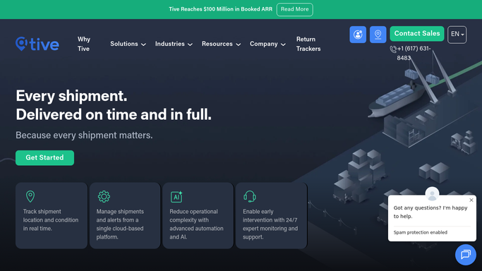
Tive - pull monthly excursion data by carrier
tive.com How to Automate Tive

WebRun opens Tive to pull monthly excursion data by carrier. - Open platform.tive.com and filter excursion events for the past 30 days
- Group events by carrier name
- For each carrier, calculate: total shipments handled, total excursion events, excursion rate as a percentage, average excursion duration in minutes, worst single event deviation, and on-time delivery rate where available
- Rank carriers by excursion rate, highest (worst performing) first
Done when All carriers have scored metrics for the past 30 days.
-
2
Google Sheets - write ranked carrier excursion scorecard
google.com How to Automate Google Sheets
WebRun opens Google Sheets to write ranked carrier excursion scorecard. - Open the carrier scorecard Google Sheet and add a new monthly tab with the current month label
- Write one row per carrier with all calculated metrics
- Add a summary header row with fleet-wide excursion rate and total shipments for the month
- Apply conditional formatting rules: red for excursion rate above 10%, amber for 5 to 10%, green for under 5%
Done when Monthly carrier scorecard tab is complete in Google Sheets with all carriers ranked and color-coded.

How do I score carriers on cold-chain temperature excursion performance using Tive?
On the first Monday of each month, WebRun pulls 30 days of Tive excursion events grouped by carrier, calculates excursion rate, average duration, and worst event for each partner, and writes a color-coded ranked scorecard to Google Sheets. Your procurement and QA teams start each month with a clear picture of which carriers are protecting your cold chain.
- Monthly carrier rankings available without any manual data pulls
- Underperforming carriers flagged in red automatically
- Historical month-by-month tabs build a carrier performance trend
Built for cold chain procurement teams · pharmaceutical QA managers · food safety compliance teams · temperature-controlled logistics operators
How is each run configured?
Secure by default
Connect once, stays signed in
WebRun signs in once and keeps each session in a persistent environment, so every run picks up right where it left off.
Every action is checked against this policy before it runs.
Questions, answered
Will it automatically send the scorecard to carriers?
No. The scorecard posts to Google Sheets for internal review. Any version shared with a carrier is drafted for your approval first. Carrier-facing performance communications are never sent automatically.
What if a carrier had only one or two shipments this month?
WebRun includes all carriers in the scorecard with their shipment count noted. Low-volume carriers are included but flagged so you can weight their excursion rate appropriately given limited sample size.
Can I adjust the performance band thresholds?
Yes. The red, amber, and green excursion rate thresholds are configurable in the run settings. The defaults are 10% for red and 5% for amber, but you can set them to match your service-level agreements.
Related templates
Put this on autopilot.
Turn it on in minutes - or have our team set it up for you.